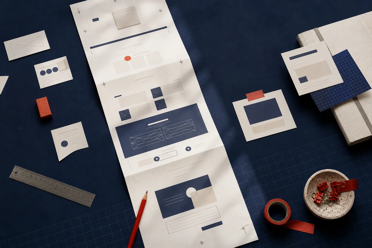
A one-page website is not merely a small website. At its best, it is one coherent argument: this is the problem, this is the offer, this is why it is credible and this is the next step.
1. Define the customer decision
Before choosing sections, write down what a suitable visitor needs to decide. A local service might need someone to call about an urgent fault. A specialist adviser might need a visitor to decide that an introductory conversation is worthwhile. Every section should make that decision easier.
2. Make the opening answer four questions
The first screen should identify who the service is for, what becomes better, why this is a relevant place to continue and what to do next. A concrete sentence usually does more work than a slogan. The main action should be visible without turning the page into an advert.
3. Explain the offer in the reader’s language
Group services by the problems people recognise. Describe what is included, what is not and what happens after an enquiry. Prices can be useful when the offer is genuinely standard; they are misleading when the real scope varies. In that case, explain how a quote is formed.
4. Use evidence people can check
Real work, named responsibilities, permission-checked client words and substantiated outcomes are useful. Anonymous superlatives and decorative numbers are not. If evidence is not ready, say what can be checked and invite a relevant reference during the conversation.
5. End with one sensible next step
Repeat the primary action after the reader has enough context to use it. Email, a short form or a telephone call may be right; three competing actions usually are not. Ask only for the information needed to make the first reply useful.
What to leave out
Remove sections that exist only because a template included them. An unattended news area, generic mission statement, stock testimonial or crowded social feed makes a short page feel longer without making it more convincing.